Within the Adobe Photoshop application, there is a type of filter that one can apply to their photograph called "curves". The curves filter can be used to perform a variety of effects on a photograph. One of the most well-known applications of the curves filter is probably the S-curve. The S-curve will be covered in the next part of this article. However, to understand how the mysteries of the S-curve, we must first understand how the curves filter does what it does.
To put it simply, the curves filter is a remapping operation performed directly on the histogram. In the previous section of this article, we discussed how one can view the act of brightening a photograph as performing an operation on the histogram (i.e. stretching the histogram by multiplying in the pixel values by a value greater than one). In this section of the article, we will explore how to use the curves filter in Photoshop to actually perform this operation on a photograph's histogram.
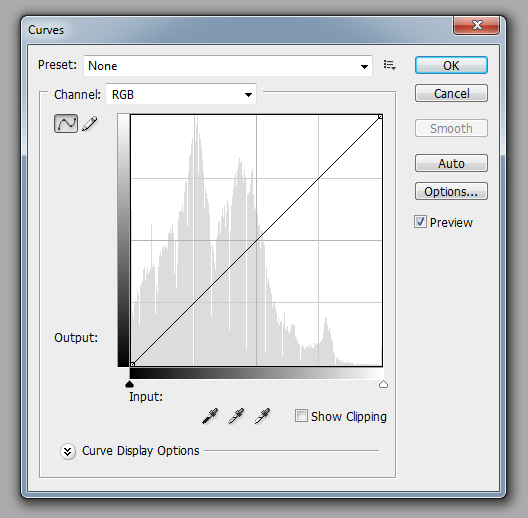
First, let's take a look at the curves filter itself so we can understand how it works. Figure 1 shows the dialog box for the curves filter in Photoshop. There are a lot of things going on in this dialog box, but for now, we will focus on the most important component. The most important component of this dialog box and the heart of the curves filter is that large chart in the center. Understanding what this chart does is vital to understanding what the curves filter can do for your photographs.

The function of the chart is to display the remapping function. The remapping function takes a pixel value as an input and outputs a new pixel value. The bottom edge of the chart represents the input value. In figure 1, an input pixel value of 0 would be on the left side of the bottom edge, and an input pixel value of 255 would be on the right side of the bottom edge. The left edge of the chart represents the output value. In figure 1, an output pixel value of 0 would be on the bottom of the left edge, and an output pixel value of 255 would be on top of the left edge. Either axis can be inverted, so a bar with a gradient (i.e. the bar that fades from black to white) is displayed along both the input and output edges to indicate how they are oriented. The background of the chart displays the histogram of the input image (this is an option that can be enabled/disabled in "Curves Display Options"). Being able to see the actual histogram is useful when you are using this chart so you can determine the exact nature of the remapping function as you are defining it.

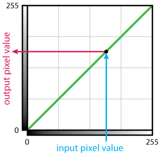
Figure 2 gives a breakdown of the chart. By default, the remapping function does nothing. That is, each input value maps to the same output value. The green line in the chart area represents the actual remapping function. In this case, it is a straight line from the bottom left to the upper right. A line like this maps the input value 0 to the output value 0, the input value 1 to the output value 1, the input value 2 to the output value 2, and so on for every possible input value. Figure 2 shows the mapping of input value 159 (blue line) to output value 159 (red line).

If we wanted to brighten a photograph as described in section 3 of this article, what would the remapping function look like? Figure 3 displays what the remapping function would look like. The remapping function is broken up into two segments. The first segment is diagonal line going from bottom left of the chart to the upper center of the chart. This section of the remapping function covers the lower half of the input values (i.e. 0 to 127) and remaps them to the entire range of the output values (i.e. 0 to 255). Essentially this line represents the multiply by 2 effect that we were applying to the photograph in section 3. The second segment of the remapping function is a horizontal line going from the upper center of the chart to the upper right of the chart. This section of the remapping function covers the upper half of the input values (i.e. 128 to 255) and remaps them all to the brightest value possible (i.e. clips them to a pixel value of 255).
Something worth noting is that since the first segment of the remapping function in figure 2 is more vertical than the do nothing remapping function in figure 3, the contrast in the darker areas of the input image will be increased. This increase in contrast is most easily seen in the grass and trees when compairing the input image and the output image.
There are several other operations that can be implemented by manipulating the histogram using the curves filter, several of which are illustrated in the figures below. Something that all of these remapping functions have in common is that they always stretch from the left edge to the right edge of the chart. However, the remapping function does not have to stretch from the top of the chart to the bottom of the chart. This is because every input must map to some output, but not all possible output values need to be used.

The remapping function in figure 4 inverts the content of the photograph. That is, darks become lights, and lights become darks. This is the equivalent to doing a mirror operation on the histogram (around the vertical axis, so left becomes right and right becomes left).

Figure 5 shows how a remapping function can be used to reduce contrast from a photograph. This is accomplished by mapping a wide range of input values to a smaller range of output values. The example in figure 5 maps the entire input range (i.e. 0 to 255) to the center half of the possible output ranges (i.e. 64 to 191). However, this comes at a cost. The lowest 25% of output values (i.e. 0 to 63) and the highest 25% of output values (i.e. 192 to 255) are not being used in the resulting output image. This example shows how to reduce contrast using a remapping function that is a straight line just to keep everything simple for now. However, it is much more common to use curved remapping functions (thus the name of the filter). This has the effect of making the histogram narrower (i.e. everything moves towards the center).

The remapping function in figure 6 does the opposite of the remapping function in figure 5. Instead of removing contrast, it adds contrast back into the photograph. In figure 6, the center half of the input value range is mapped to the entire output range, while the lower 25% of input values and the upper 25% of input values are clipped at values 0 and 255, respectively. In other words, the remapping function in figure 5 squeezes a large range of values into a smaller range of values, while the remapping function in figure 6 stretches a smaller range of values into a larger range of values. The effect of applying the remapping function in figure 6 is to make the histogram wider (i.e. everything moves away from the center).
It's tempting to think that applying to both of the remapping functions from figure 5 and figure 6 (in that order) to an image would just result in the exact same image (i.e. figure 5's remapping function takes away some contrast and then figure 6's remapping function adds the contrast back again). While this is mostly true, it's not entirely true. Can you figure out what the problem is? I'll give you a hint. Remember that pixel values are stored as whole numbers.

Figures 7, 8, and 9 show some other remapping functions that result in some interesting effects. Think about each of the functions and try to figure out how the remapping function effects the histogram of the input photograph.


In the next section of this article, we will discuss one of the most widely applied and well known curves, the S-curve.